
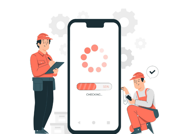
If you want to know what the weather will be like tomorrow or need to know about the next train time, you can quickly search for it on the go and receive an answer within seconds. Whether for online travel plans or for just looking up information – smartphones have become our loyal search companions. Studies show that more and more users are also making purchase decisions on the go, thanks to the easy availability of retail shopping options via smartphones.
This is exactly why businesses should tactfully position themselves in the mobile world and rely on their responsive website designs to provide users with a perfectly functioning mobile experience.
In this article, we are going to discuss a step-by-step strategy to help your website rank higher for mobile searches.
MOBILE-FIRST – FROM TREND TO STANDARD

The term “Mobile First” stands for a concept that encompasses the mobile optimization of websites and web designs. The mobile version of a website has become the primary version for search engines due to an enormous amount of mobile searches that have far surpassed desktop searches.
The idea behind Mobile-First is to first show the version intended for mobile devices and then second, the desktop version. This is all happening because as previously mentioned, more and more users are using smartphones on the internet. Mobile optimization usually takes place at the beginning of a new website conception.
For a long time now, it was rumored to be happening, but this is no longer just a rumor that you may ignore or opt out of. Mobile First has established itself as the standard and should be followed by every website if it wants to stay at the top of search results. User-friendliness on mobile devices has been a ranking factor with Google since 2015 and has been given more and more weight ever since. In March 2021, Google completely switched to using the mobile version of a website to evaluate a ranking.
Check out the Website Optimization Tips for Mobile-First Indexing.
WHAT DOES THE MOBILE-FIRST APPROACH MEAN?

It is important to know that the mobile-first index is a smartphone-first index. Tablets, for example, are viewed by Google as desktop-like devices in the context of the Mobile-First Index. For websites, it is primarily about optimizing the website for smartphone users if they do not want to drop in the search engine rankings.
According to one study, mobile internet users will contribute to more than 80% of all searches in 2021. Google always adjusts its ranking factors to create the best possible experience for its users, and that’s why you should always be up-to-date and understand the concept of mobile SEO.
MOBILE SEO – STEP-BY-STEP GUIDE FOR MOBILE OPTIMIZATION
Mobile comes “first.” To what extent do SEOs and website owners have to adapt their strategies in order to reach as many users as possible? The basics of SEO hygiene will also apply to mobile devices, and you should pay attention to the Core Web Vitals as part of your optimization strategy. In the following article, through a step-by-step guide, we will show you which aspects are particularly relevant for mobile SEO.
1. Taking stock of Mobile SEO
The first step before haphazardly optimizing a website should be a quick SEO assessment or SEO audit. What is the status quo? For a website to rank well these days, it should work well and be easy to use on mobile devices. A mobile subdomain is not recommended here. This is a separate domain on which only a small part of the desktop version is displayed. The problem: two domains mean twice the effort. Every time you change something in the text, add an offer, or a new service, you will have to do this on two pages. Not ideal!
With that being said, switching to a responsive website is worthwhile and a smart investment. The presentation of the website is automatically adapted to the respective device.
2. Technology check

A technically flawless website is the biggest hurdle in mobile SEO. With a responsive site, you have already taken the first step and are heading in the right direction. Nevertheless, this must also be continuously optimized. In an SEO audit, a website is examined for important sources of error. Aspects such as information structure and internal links should be verified and checked here.
Users should be able to navigate easily through the mobile website to quickly find the information they are looking for. Redirect chains, i.e., if a subpage is only reached after several redirects, are a no-go and should be avoided at all costs.
Another important aspect of mobile SEO is fast loading page times. The tool Page Speed Insights by Google makes it easier to identify the score and issues of the website and immediately gives instructions on how to resolve problems. The longer the loading time, the more likely it is that users will bounce off. Just a few milliseconds can make a difference here. If a website is slow, it can help to reduce the size of the images and use fast-loading formats such as WEBP. Ideally, there should only be one CSS and one JavaScript file.
3. Usability: Optimal experience on a small screen

Usability, i.e. user-friendliness, is undoubtedly among the top ranking factors since the rollout of the Page Experience update. This is the only way to achieve a long dwell time and, in return, a low bounce rate. An analysis with subsequent usability optimization offers a structured approach and delivers data-based results.
For mobile optimization, in particular, it must be noted that the display is much smaller (in comparison to tablets and desktops), and the font size and buttons have to be very carefully adjusted. The design may also have to be modified. Tables, for example, should not be too wide to be fully displayed on mobile devices.
4. Local SEO

The optimization for mobile devices shouldn’t end with your website. Local SEO is particularly relevant for mobile search. Those who are on the go want to find answers quickly with their smartphone. Where is the next dinner going to be? What is your favorite restaurant? A new one? What time does the supermarket open? Companies should regularly optimize their Google My Business profile and keep the company information, photos, and services up to date.
Check out our Local SEO Guide to optimize your website.
HELPFUL TOOLS FOR MOBILE OPTIMIZATION
Do you want to know how well the mobile version of your website is doing in terms of user-friendliness? In addition to the tool for checking your page speed, we have selected two tools that can help with the mobile optimization of the website.
The Google Mobile Optimization Test tool does exactly what it says on the box. Here you can enter the URL of your website and find out whether everything is being played correctly on the go. At first glance, however, you won’t get any recommendations for optimization or tips. However, if you have access to the Google Search Console, you can view the resources that are not loaded.
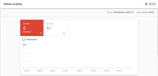
The Google Search Console helps optimize the mobile website version. Under the “Mobile Usability” feature, various errors are listed that can lead to problems with mobile use. Make sure to check your website here regularly, especially if you add new pages or post blog posts frequently.
MOBILE-FIRST OR USER FIRST?

Even if website operators have observed an increase in access via mobile devices in recent years, if you take a look at the connection between device use and conversions, it quickly becomes apparent that the majority takes place on the desktop – even today. The mobile view of the website is important. Nevertheless, we don’t want the desktop version to be neglected as a result of mobile optimization because access or not if the click to buy is ultimately made on the desktop, everything should be flawless here.
So always have the needs of the users in mind and ensure the best possible user experience, both mobile and desktop.
 Summary


