What does that mean for your website’s rankings? Well, if Google only uses the mobile version of a landing page as the basis for the evaluation for the ranking, you or your SEO agency should verify now, whether all of the pages on your website are optimally positioned for mobile crawling. Up until this past month, about 30 percent of all the pages that rank in the Google search results had still been getting crawled by the desktop Googlebots, but by the end of this month, those will be put to rest too.
Going forward, even pages that may not yet meet all of the mobile requirements will still be visited by the mobile Google crawler. As a result, if your website is not optimized for Mobile searches, you can expect your rankings to go down from March onwards.
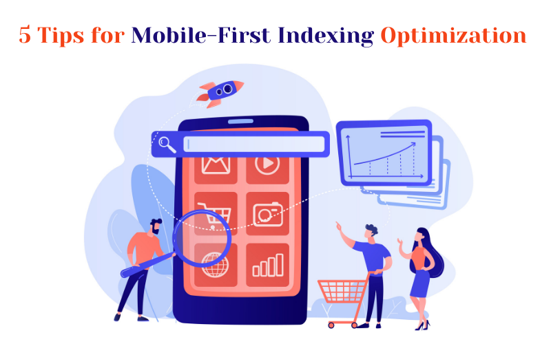
In this blog post, we will share 5 essential tips to move on, quickly, for Mobile First indexing. Ready to make your website mobile-friendly? Follow these 5 tips to help your website keep its rank or even better, rank higher in the Google search results!
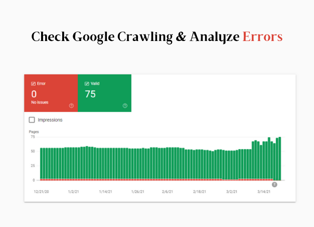
Mobile Indexing Tip # 1: Make Use of Google Crawling and Analyzing Errors
Which crawler does Google use to visit your website? Will the Google Crawler be used for desktops or smartphones?
If you are hearing about the Mobile Search crawlers for the first time, you might have many burning questions at this point. Don’t worry, Google gives you answers to all your queries through its various tools. In Google Search Console, webmasters can see the “user friendliness on mobile devices” and determine which crawler is visiting all of the webpages that are indexed from their website.
Additionally, You can easily check any errors with an overview of all URLs included in the Google index. For instance, if the content is wider than the screen or the clickable elements are too close together for certain pages, Google Search Console will show you a full report of all of the pages affected by it, for you to fix.
Mobile Indexing Tip # 2: Rely on Responsive Website Design

For years, Google has been consistently asking websites to rely on responsive web design. With this option, the design adapts to the width of any mobile screen and there is no requirement of multiple source codes for the same content on different devices for one URL. Once again, Google advises against having your mobile subdomain, and this was popular in the early years of the mobile web. No longer.
In contrast, webmasters don’t have to frantically convert an m-dot domain to a responsive web design over the summer; Google continues to support separate mobile domains as well as dynamic serving. However, it can’t hurt to work on a move towards a responsive format to be well-positioned for mobile SEO, in the long run.
Mobile Indexing Tip # 3: Ensure Uniform Content on All Devices

Some webmasters and SEOs rely on different content on the desktop and smartphone versions of their website, despite responsive page versions. In the desktop version, often there is more long content, which is “hidden” in the mobile version in tabs or accordions for a supposedly better user experience and only becomes visible when you tap on it. Going forward, this content will no longer be used for ranking in search results.
Therefore, Google advises that the content in all page versions should be uniform for all devices. In addition, meta tags, structured data, titles and descriptions, images, videos, or links on a webpage should also match all its variants.
Mobile Indexing Tip # 4: Optimize Page Loading Time on Mobiles

Since the Google Speed Update (July 2018), the loading speed of mobile websites has been a major ranking factor to Google. It’s been proven by actual studies that landing pages that ranked in the top 10 of Google results load faster than URLs in the lower results.
If you’re not sure how to reduce the page load time on your mobile website, you can start with these three tools for checking mobile performance:
1. Speed in Google Search Console: The experimental load time report in Google Search Console is based on actual data from Chrome users. Above all, the speed trends can be read over a longer period – if the proportion of slow URLs on the mobile device increases, it will ask you to take action to resolve it.
2. Google Pagespeed Insights: This tool from Google provides a good overview of the load time performance of every URL for desktop and mobile. While the values for the desktop performance are likely to be better for many sites, the tool can provide initial information for construction sites in the area of mobile performance optimization.
3. Google Lighthouse Extension: As an open-source tool for the technical audit of a website, Lighthouse offers a great overview of the performance of a website through various user agents. The URL-based tool can be accessed from the developer tools in the Chrome browser.
It is very likely that with the switch to the mobile Googlebot, the importance of mobile page speed will also grow. Google has been pushing this topic for years; it would not be surprising if a new level of performance in the mobile speed frenzy comes from all of this.
Mobile Indexing Tip # 5: Regularly Check Your Mobile Performance
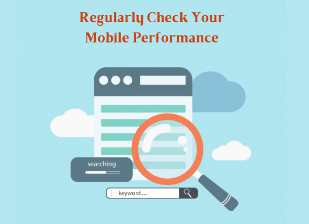
If Google is completely moving over to mobile indexing, ranking changes will certainly go hand in hand with it. Pages with slow mobile performance are likely to have problems with their mobile rankings, and pages with shorter content in the mobile version could have problems with their desktop rankings. In contrast, modern websites with a fresh, responsive mobile experience could gain visibility in organic search results.
So it can’t hurt to pay particular attention to SEO visibility and rankings on various devices, especially in the transition phase to full mobile indexing.
Conclusion: NOW is The Time to Act!
There are only a few days left before Google completely moves over to Mobile First indexing. A responsive website with identical content on desktop and smartphone as well as good mobile performance values should be at the top of the to-do list for business owners, webmasters, SEOs, and online marketers so that there are no negative surprises after March 2021.
Can we support you in implementing your SEO and content strategies? Just make an appointment to get to know how your website is currently performing. It will be our pleasure to assist you!
 Summary


